At Transform Consulting Group, we are passionate about empowering organizations to use data effectively to measure and achieve success! We take pride in guiding organizations to apply the best practices for visualizing data, turning complex information into easy-to-understand charts and graphics. These visual tools support data storytelling across various formats, such as comprehensive reports, succinct one-pagers, engaging presentations, or eye-catching social media posts.
We recently completed a study with Turnstone to determine their services’ social return on investment (SROI). Our team followed an SROI methodology process to identify the organization’s inputs and outputs, define outcomes, determine the value saved, and, finally, calculate SROI (read more about that process here).
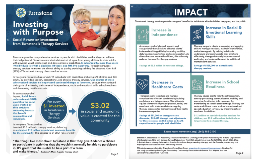
This process and the results were shared within a comprehensive report and a two-page summary (which you can view here). We featured visual elements like charts and graphs, bolded statements, infographics, tables, quotes, call-out boxes, and specific colors. So, how did we decide “what” to visualize in these various elements?
Decide What to Focus On When Visualizing Data
Relevant and Significant Findings
Rather than creating a graphic for every data point collected, we intentionally chose charts and graphics to communicate relevant and significant findings. Ask yourself what you want the audience to take away from all the information gathered?
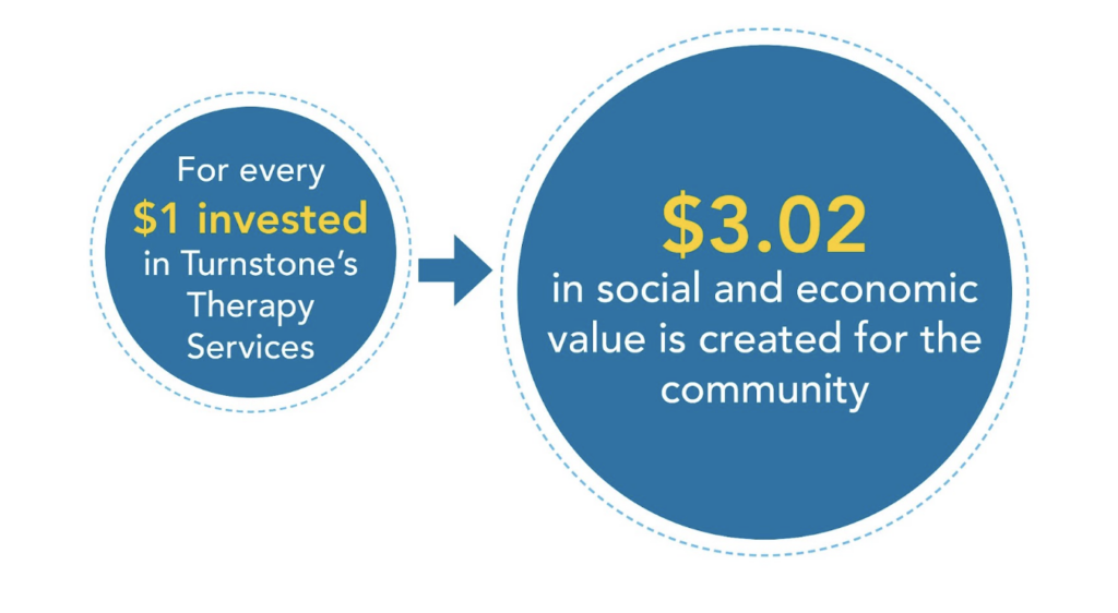
Turnstone’s ultimate goal of the SROI study was to quantify their impact, communicate their impact, and improve sustainability. This graphic communicates the main takeaway of their SROI.
Context Through Comparisons and Trends 
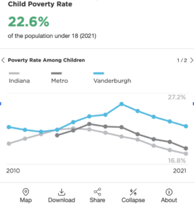
It’s simple to share a single data point, like 100 people received services, but what does this mean for the reader? Is that high or low? How does it compare to other similar organizations? Adding context to visuals through trends and comparisons, especially in visuals, is a quick way to support data storytelling and convey significance.
Turnstone reviewed organization data across two years and by client age groups. This image shows the child poverty rate, including a trend by geographic area.
Here are some contextual categories to consider:
- Geographic: National, state, county, zip code, etc.
- Demographic: Race and ethnicity, age group, gender, income status, education level, etc.
- Research and Peer Benchmarking: Similar organizations and industries and/or organizations aspiring to be more like.
Read more about putting data into context in this blog.
Relevance to Audience and Intended Use
Consider the audience and the intended use of the report, handout, presentation, or post. Different audiences have different knowledge bases and backgrounds. For example, an internal audience within an organization will understand its services and programming, but people outside the organization may need more context and definitions.
When thinking through the audiences, we created two pieces for Turnstone: 1) the full Social Return on Investment report and 2) a public-facing, one-page overview that can be shared with partners, potential donors, etc. The overview uses clear titles, bolded statements, quotes, and infographics to grab the reader’s attention and emphasize essential details.
Marketing and Communications
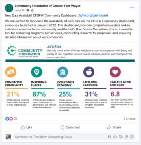
If the data and information are showing success, share them! If the data helps convey a need, it can be used as a tool to obtain resources. Use marketing and communications tools, like emails, newsletters, and social media posts, to highlight eye-catching findings. These graphics and charts should be able to communicate a quick, compelling message and stand alone with limited to no narrative context.
We would love to collaborate with you to incorporate these best practices for visualizing data into your next project, whether a needs assessment, evaluation, or research study. Contact us today!

