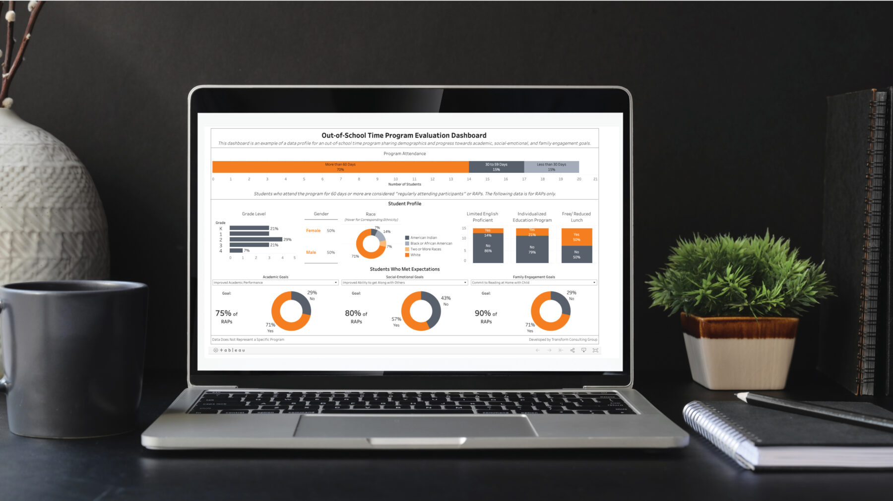
We’ve said it in the past and will repeat it; we are proud #datanerds at Transform Consulting Group (TCG). Too often, we work with clients who have data but don’t know how to use it. Or maybe they lack a systematic approach to acquiring data or managing projects. We get it. We understand that data can be intimidating and overwhelming, but it doesn’t have to be that way!
Our solution to making data easily accessible, user-friendly, and visually appealing? Interactive dashboards. Here are four reasons why we love them (and why we think they may be the perfect solution to your data woes):
1. Highlight Interactive Dashboard features.
A “live” dashboard has features including filters, actions, and pop-up information boxes. Users can seamlessly navigate from one page of a dashboard to another. For example, see the video below. The 2020 ELAC Annual Report Interactive Dashboard includes four pages. The location filter allows the user to dive deeply into data related to their county and/or region. The filter then applies to each page of the dashboard. Users can navigate from one page to another by selecting a page tab at the top or using the arrows at the bottom of the dashboard.
2. Connect to Multiple Sources.
Programs can link together multiple data sheets from their program information to visualize data in one place. In addition, they can connect their program data to public data (population, poverty, income, etc.) for context to show how a need and/or how their program meets the needs of their audience. For example, the Center for Leadership Development offers how many of their students go to college, compared to the county or Indiana college-going rate (view a similar dashboard example here).
3. Assist in Storytelling.
Dashboards allow the builder to guide the audience through a story. The United Fund of Wabash County has an Asset Map of over 300 community resources. Rather than sorting through a list, the interactive dashboard includes page-by-page instructions on navigating and filtering the data to find the resource someone is searching for in the community. Read more about how to use data for storytelling here.
4. View & Share Data.
Interactive dashboards allow for a variety of visual and sharing formats. Interactive dashboards can fit onto the viewer’s screen (desktop, laptop, mobile, etc.). Most dashboards are available for download or print if a viewer wants to go beyond the online link.
Some organizations do not have the time, expertise, or capacity to build an interactive dashboard. Our goal is to make data visualization easier and more accessible for your team. You can hire us as your coach or teammate – we can make dashboards for you or train your team to make them! Let us help you with your data needs. Contact us today.
Overview of interactive features in the 2020 ELAC Annual Report Interactive Dashboard

