Client Story
Location
Industry
Need
Project
Building a Dashboard for Community Leaders
The Challenge
Community leaders drive Leadership Everyone’s regional initiative called VOICE (Visioning Outcomes Inspiring Community Engagement). Through Regional VOICE—which includes Vanderburgh, Gibson, Posey, and Warrick counties in Indiana, as well as Henderson County, Kentucky—these leaders collaborate to create a shared vision for the region and leverage pooled resources to harness talent, grow regional assets, bolster employment, and advance development. Leadership Everyone actively and intentionally engages people with diverse perspectives and experiences so that ALL voices are heard when tackling today’s urgent needs and shaping a collective vision for tomorrow.
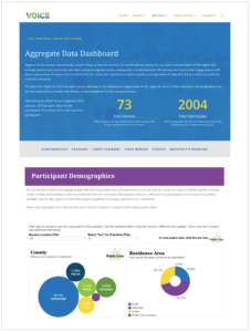
Leadership Everyone completed their second VOICE initiative between 2020 and 2022, holding 73 sessions and involving over 2,000 individuals. In this phase, they needed a tool to share the extensive information, data, and feedback collected with all of the involved communities. Recognizing that data transparency is critical for building trust and inspiring action, they turned to Transform Consulting Group (TCG).
TCG reviewed and audited Leadership Everyone’s data collection and analysis processes for the VOICE initiative. They made recommendations to improve data gathering and enhance internal systems. Finally, TCG created an interactive dashboard using the VOICE qualitative data, ensuring that community leaders and stakeholders alike can readily access and utilize these crucial insights.
The Solution
TCG completed an audit of all VOICE data and information. We reviewed and revised their data tools, developed a data management plan, and created a system to connect the different data sources to their new dashboard.
TCG worked closely and collaboratively with Leadership Everyone to build their new dashboard. We first identified the purpose for the dashboard and who will use it. Second, we developed guiding questions that we wanted to frame the data in the dashboard to understand what we want to learn and know. Next, we worked on the design and layout of the dashboard keeping all of these factors in mind. Lastly, we connected all of the data to the dashboard. We pulled in additional publicly available data to provide context and understanding with the qualitative data they had collected from their VOICE sessions. For example, they wanted to have broad representation of individuals in each community, so we used U.S. Census data to easily compare individuals who completed a VOICE sessions with the general population.
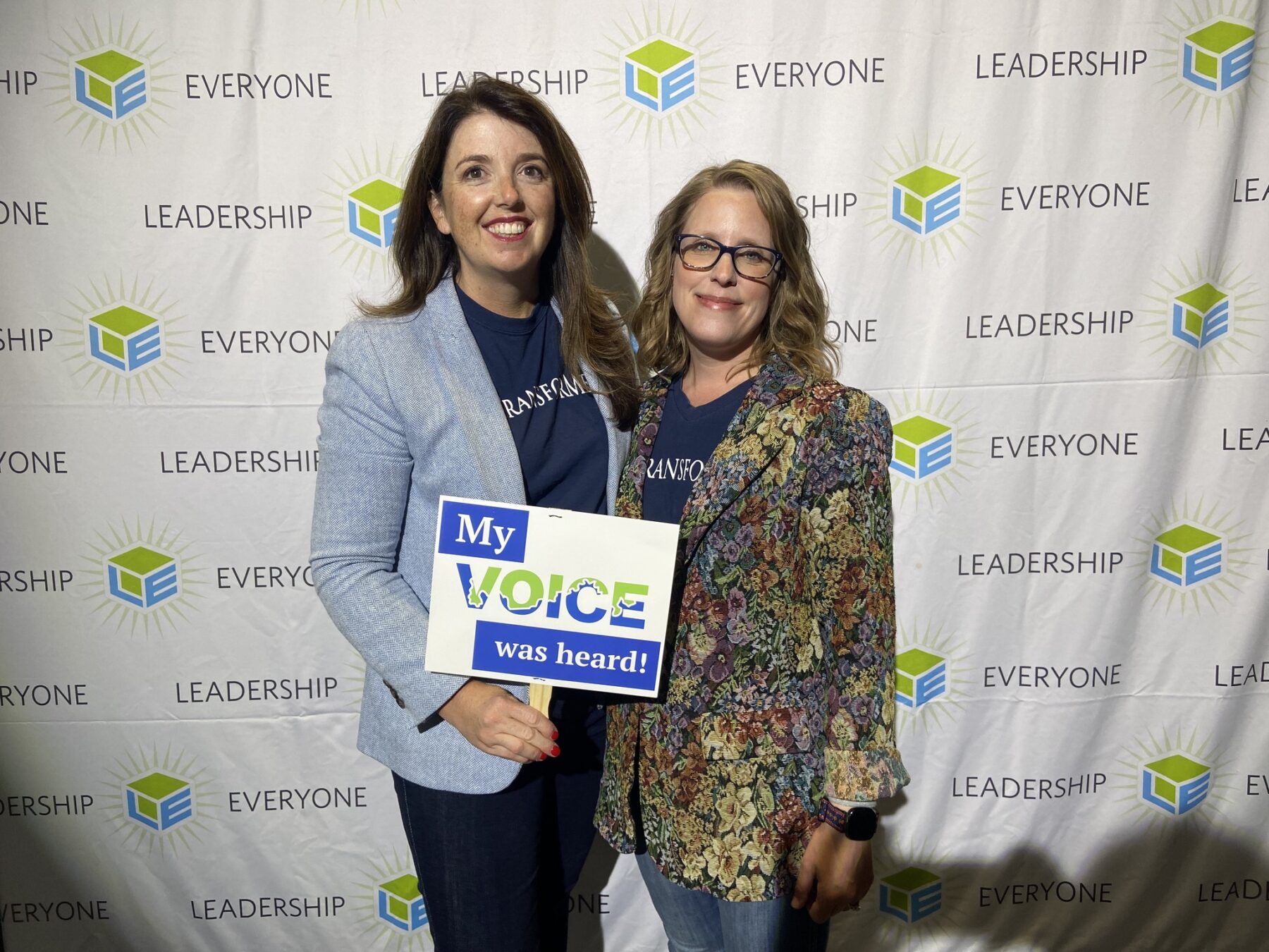
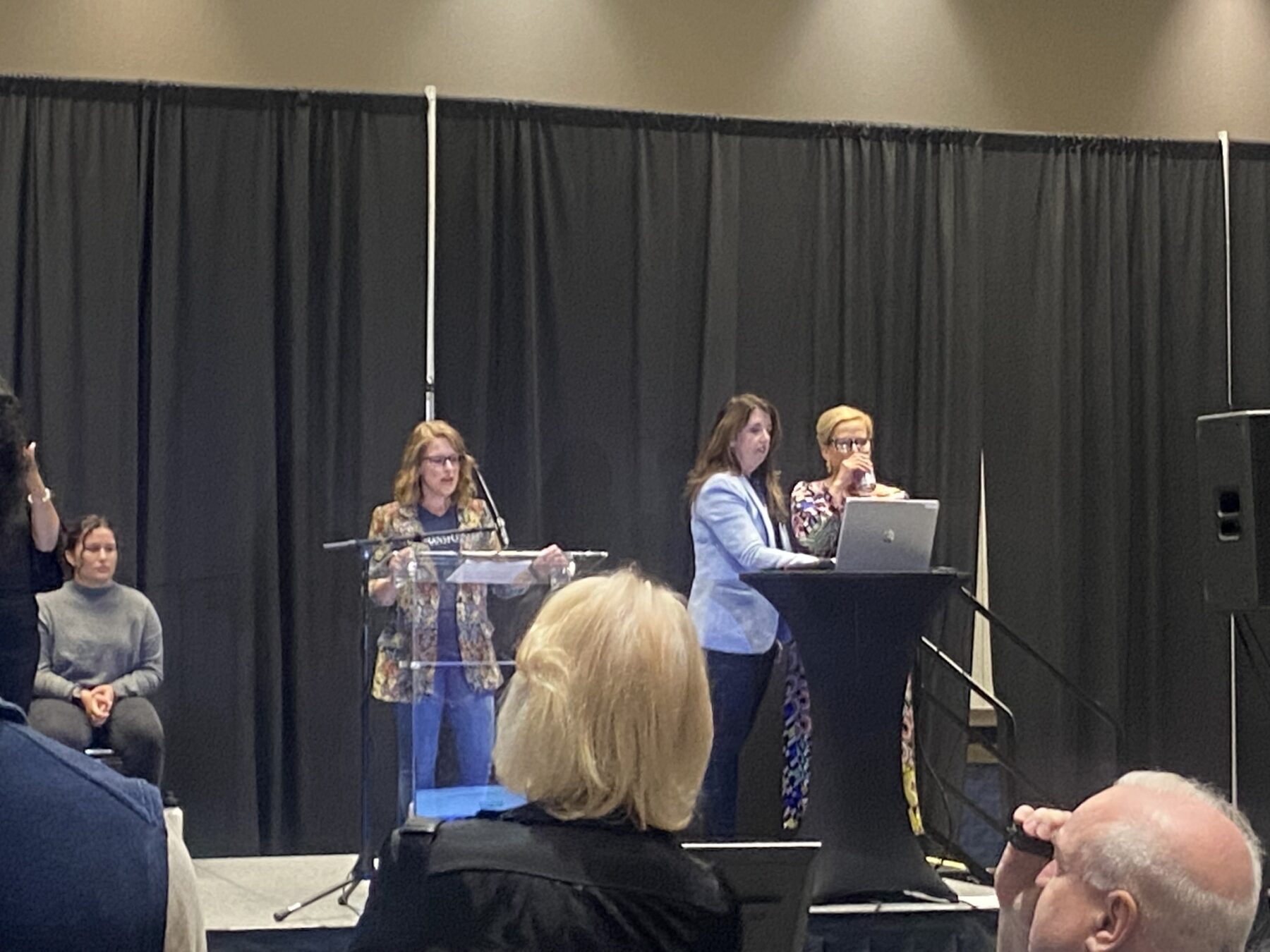
We used Tableau Software to create a user-friendly dashboard that is structured by their key questions and metrics. We then worked to publish materials publicly and presented the final interactive dashboard to the Leadership Everyone team and stakeholders at a public launch community event.
TCG transferred ownership of the dashboard to their staff. We created a training manual to maintain and update the dashboard. We provided individual staff training to those who will have a role in using the data and sharing the dashboard trained Leadership Everyone’s staff on managing and using the dashboard.
The data highlighted in their dashboard represent the backgrounds of individuals who participated in the VOICE sessions, their passions, what they hope to see carry forward and leave behind in our community, and their visions for the future. The dashboard builds upon the success of Leadership Everyone sharing and making the data they collect accessible. The dashboard was designed in a way to make it easy to read and in a layout that tells a story.
Together, we created a user-friendly, accessible tool that allows regional partners to make informed decisions. Some new features on this dashboard include:
- Publicly available data for additional context and comparisons
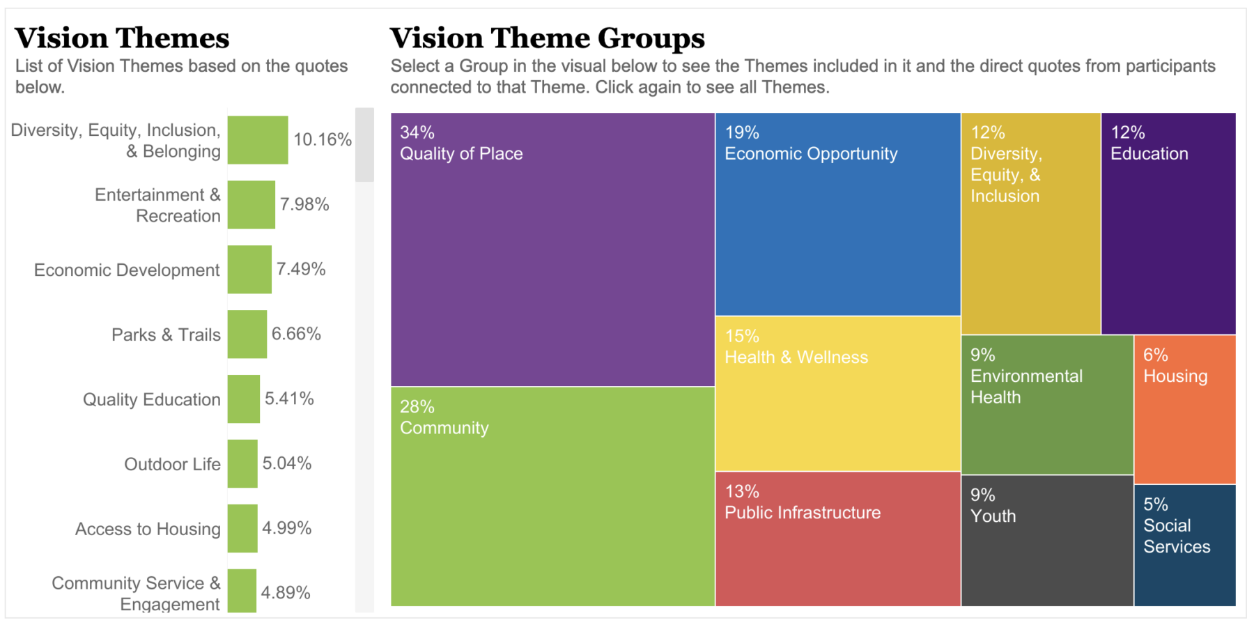
- Ability to see the connection between the direct quotes to themes indicated by participants
- More straightforward navigation to the different sections in the dashboard
- Ranking of vision data by the diverse backgrounds of participants
In the demographics section of the dashboard, there is a colorblind filter, allowing the visuals to be more accessible and not relying on color to differentiate the information. Users can also filter the data by the different locations of the sessions. On each demographic visual, a button in the right-hand corner lets users see publicly available data to understand how inclusive Leadership Everyone was in ensuring all voices were heard.
This dashboard allowed our team to show how you can visualize qualitative data in a dashboard. For what participants are passionate about and what they want to see carry forward and leave behind in their community, direct quotes can be seen to the connected theme. On the vision’s dashboard users can filter the data by different population groups, such as race/ethnicity, marital status, LGBTQIA+, Disability Status, Age, and Gender, and see the top visions of the different groups.
Throughout the dashboard, we include a narrative to help the user understand where the data comes from and to follow the story. This dashboard is a tool we hope everyone uses. It tells a story of their communities’ vision in addressing the pressing needs of today.
The Outcomes
- Completed an audit of their data, data collection tools and data collection process
- Reviewed and analyzed their data
- Made recommendations to improve their data collection process
- Created an Interactive Data Dashboard
- Presented the new VOICE Dashboard at the Leadership Everyone Regional VOICE Reveal Event
Our Client Stories


Let's Transform the WorldOver Coffee