
This is the last of a three-part series on nonprofit storytelling. In the first blog article, we discussed why organizations should visualize their data and how those visualizations can be used to tell a compelling story about outcomes. In the second part, we discussed how storytelling should be done compellingly and engagingly. Now, we’ll talk about creating infographics to help tell your story. In a previous blog, we discussed how a nonprofit organization can use infographics to maximize impact.
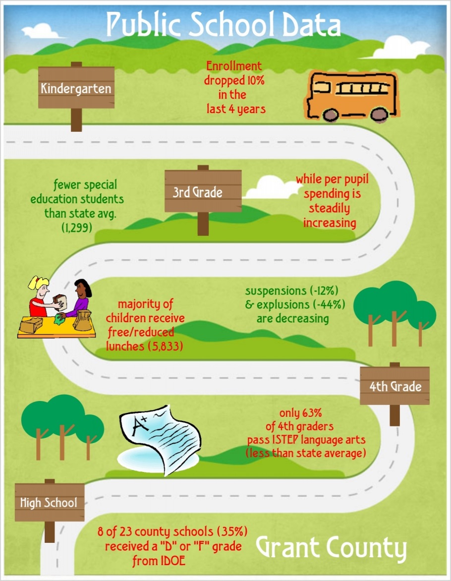
So, how does Transform Consulting Group create infographics? Recently, Transform Consulting Group began working with the United Way of Grant County. As a first step in our consulting work with Grant County United Way’s leadership, we needed to complete a community assessment of the county’s health, education, and financial well-being. Rather than present a “cut and dry” report containing only numbers and charts, we supplemented our report and presentation with several different infographics.
We used a free web-based service called Piktochart to create infographics like this one (to highlight education), which allowed us to easily visualize the successes and challenges in the community:
Infographic Journal is also an excellent reference that collects the best infographics on the web in one place. We like this one about Shedding Light on America’s Homeless Veterans.
Does your organization need help telling its story? At Transform Consulting Group, we can help organizations collect and visualize their data to support organizational development and fundraising. Contact Us today for a free consultation!