Carly Fiorina said: “The goal is to turn data into information, and information into insight.” Lutheran Services in America is working to do precisely that!
Lutheran Services in America partnered with Transform Consulting Group (TCG) to create a data dashboard to make program data collected by rural leaders within their national collaborative more accessible for their teams. Lutheran Services in America sought an easy-to-read dashboard to help rural leaders within their national collaborative, the Rural Aging Action Network (RAAN), better understand their program’s data, enabling real-time program improvements and fostering collaborative learning.
The first step in our data support for Lutheran Services in America was to build a data dashboard using the program data they collect from the RAAN leaders to help evaluate and assess their goal of addressing gaps in care for underserved older adults in rural communities. Because RAAN leaders and programs are spread out across the country, the dashboard is designed to give everyone access to the data metrics and visualizations they need at any time to inform program improvements and learn from each other’s programs.
This post will walk you through our engagement with Lutheran Services in America to build an interactive dashboard and our next steps to continue supporting their data needs.
Are you interested in building a dashboard for your organization? Please read our blog on the seven steps we use to guide organizations through this process.
 Determine the purpose and intended use.
When we started working with Lutheran Services in America, the first thing we did was understand the purpose and intended use of the data being collected for RAAN. The purpose and use of the dashboard were to provide RAAN leaders with access to data in a more user-friendly way to make programmatic improvements and learn about the strengths across the RAAN collaborative.
 Define the research questions.
Lutheran Services in America already had the research questions they wanted to answer, and the RAAN collaborative leaders reported data related to these questions. We helped organize the data that was being reported to help understand which data point answers which key research question.
- How is the community being engaged?
- How many older adults are engaged, and who are they?
- What are the needs or gaps in the care of Older Adults?
- Was RAAN effective in addressing the needs and gaps in care?
Once we understood, we developed clear metrics or key indicators (KPIs) to inform RAAN’s work. A key component of having clear metrics is that everyone within the organization and related audiences understands the importance of these metrics, including how they relate to their role and team. Check out this blog to learn how to make clear metrics in three easy steps.
 Gather and organize the data.
The next step is to gather the data to answer the research questions and KPIs. Before the dashboard, RAAN’s data was stored in multiple spreadsheets, making it difficult for the entire collaborative to see data as an aggregate in real time. In addition, RAAN leaders were also challenged to interpret the data consistently across all of their programs. The new interactive dashboard allows the entire collaborative to look at the same data with quarterly updates.
As we built the dashboard, we identified improvements to the data collection process. TCG and Lutheran Services in America modified the RAAN collaborative’s reporting template to collect their data. When reviewing and organizing the data, we learned that data entry issues can be familiar with data entry. We revised the reporting template to help avoid these mistakes and to ensure the data is clean and accurate.
TCG plans to provide definitions and a guide to help the RAAN collaboratively enter data even more accurately in the future. Data quality is an ongoing process!
Once we gathered the data, our next step was to analyze and visualize the data. TCG worked with Lutheran Services in America to create a dashboard for the RAAN collaborative to use internally to see their progress and identify gaps in care for older adults. The dashboard also allows the RAAN leaders to see how others are doing to facilitate deeper collaboration and learning from each other.
The dashboard has four main sections organized by the research questions we identified at the beginning of our work. On each page, key data points are highlighted to help answer the research question. The different organizations within the RAAN collaborative can filter all the data, making it easy to assess the various programs. The filter has helped the RAAN leaders identify each RAAN’s area of strength, leading to conversations on possible solutions and program improvements within their organizations.
Use the data
Lastly, we want to use the data we have worked so hard to collect to make informed decisions, celebrate success, and share with others.
Now that we have analyzed the data, Lutheran Services in America can use the data to make informed decisions and improve programming to reach more underserved older adults and mobilize additional community partners in rural communities. We are beginning to build staff capacity to use the dashboard. We want to ensure everyone who accesses the data understands it and knows how to use the dashboard to inform their work.
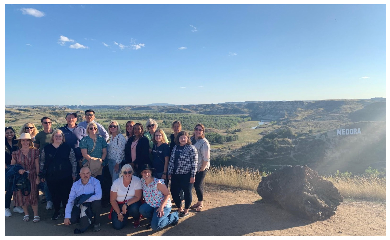
Our TCG team recently met with the RAAN leaders to present the dashboard and train them on using it. We were together with the entire RAAN collaborative in Medora, North Dakota.

