
You hear us say regularly that we’re big #datanerds at Transform Consulting Group. We have many blogs with tips on using and visualizing data, including why we love interactive dashboards. Now we are taking it to the next level and sharing how to enhance your dashboard with interactive mapping functions.
We recently completed projects with the South Dakota Afterschool Network and the Mississippi Statewide Afterschool Network. Both engagements included 2 phases: 1) collect data on summer and afterschool programs across the state and 2) develop mapping tools to summarize the availability of programs and assist families and communities to find programs.
Creating Interactive Mapping Tools
Determine your audience. Who do you want to see and use the program information? Determine the key audience(s) to help decide the best tool(s) to create with the program information you gathered.
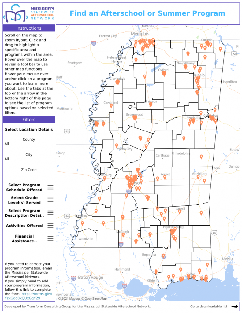
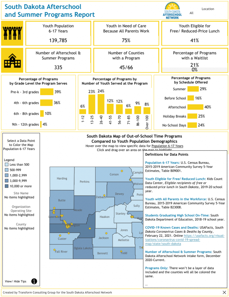
In both mapping projects, we decided to create two unique tools. One is geared toward families and community members finding programs, and the other map is geared toward key stakeholders and decision makers. The searchable database allows families to select key program detail filters, such as hours of operation, ages served, and location. The other dashboard geared toward stakeholders and decision makers provides a summary of available programs across each county paired with public demographic data. These layers allow users to assess the supply and demand of programs and see gaps throughout the state. You can view Mississippi’s searchable map and the program’s report map on our Tableau Public page.
Collect information. What information do you want to share? Ensure data is available, up to date, and complete. You can develop survey tools or call programs to add and update program information. For both South Dakota and Mississippi, we disseminated surveys across the state to gather program information directly from programs. Once we collected program information, we gathered other public data on youth populations (poverty, need, school performance, etc.) to layer with the program information. For example, understanding third grade assessment scores with access to afterschool programs will inform funders and decision makers where additional funding and resources are needed to support students. Check out our blog on go-to data sources to find additional information for your map.
Determine the mapping tool. What tools or systems do you have to create your mapping tools? Interactive mapping tools are not simple to create. The afterschool networks we worked with hired us as a third party consultant to develop these mapping tools for them. We prefer to use Tableau products to create our interactive maps, but there are a variety of tools available (Power BI, ESRI, or Map Maker).
Build the map. Once you have clarity on your audience and information to feature, it’s time to start building the map. Offer a variety of visuals, context, and other interactive features (filters, hover, etc.) to best inform the audience. During this process, it may be helpful to seek feedback from close partners to determine how easy the tool is to use and understand.
Promote and communicate the final map. After the map is finalized, you’ll want to share your hard work and new resource! You may decide to embed the map on your organization’s website, link through email and/or social media posts, and share at conferences and events. We worked with South Dakota to embed both of their mapping tools on their website. See the programs and data layer map here and searchable map here. This allowed for additional narrative and instructions to be built around the dashboards online. In addition, we supported preparing downloads for local legislators in the state to understand how many afterschool programs are in their region. These tools can be customized to the needs in your community and state.
Ultimately, these mapping tools allow our clients (and the communities they serve) to find out-of-school time program information in one place while also identifying gaps. We believe data is most meaningful when it’s user-friendly, organized, and accessible to you! Do you need support making sense of complicated data? A mapping tool (or asset tool like we highlight here) may be the answer for your community. You can see more dashboard examples here. Contact us to discuss how we can work together to map your organization information.