We say we’re #datanerds at Transform Consulting Group. However, for a communication and marketing person like myself, I will admit that data intimidates me. I prefer using words and emotions to convey ideas rather than numbers and excel sheets. So, how does that translate to our data-informed work at TCG?
In Nancy Duarte’s book “Data Story” she says, “Facts aren’t as memorable as stories.” She highlighted an experiment that revealed 5% of people remember individual statistics while 63% remember the stories.
In our work – as an organization and for clients – we have to have both data and storytelling if we want to make an impact. If you search through our blogs, we have several data-related posts (here, here, here, and here). We also have a whole marketing series (here, here, here, and here). This blog is bringing together those 2 worlds – with 5 tips for using data in your storytelling.
5 Tips for Using Data to Tell Your Story

1. Keep it simple.
Numbers and data may seem far from simple at times, especially when you’re dealing with really complicated issues. The reality is though, most of your stakeholders are not technical experts. They don’t know the lingo. They don’t know your measurable. You don’t want to bog down your audience with so much “meat” that they can’t absorb anything. Simple is better. Be clear, get straight to the point, and look at your data through the lens of an “everyday” person.
2. Make it relatable.
Why is the data important? Who does it impact? It’s hard for even the biggest #datanerd to get excited about an excel sheet full of numbers or a report with a bunch of charts. However, if you explain the implications of the data, people will connect. We like to call this the “so what?”
What does it mean for your community when student graduation rates decline? How does it impact employers when there aren’t enough early childhood education programs available for working families? What does it mean for your community to have a high rate of child maltreatment? Don’t just spout off facts and figures, explain the why and significance of your data.
Extra Tip: Know your audience. Know who you are talking to so you can shape your message in a way that relates to the person in front of you. Your data story should be framed differently for your audience. How you speak to a parent or client will look different than the talking points used with a funder or partner.
3. Utilize clear graphs and slides.
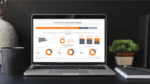
When surveying top executives from large organizations across the county, Duarte found the majority preferred simple visuals to get to the point. They requested a bar graph, pie chart, or line graph. We create some pretty fancy data dashboards here at TCG, but we know that the most important data point needs to be the first thing you see. Don’t bury it with too many special features, graphics, or animations. Also, be mindful of creating clear titles to describe your graphs and charts. Be intentional with the type of chart you have selected, including the colors.
4. Structure your story.
We learn from a young age that a story needs to have 3 components: a beginning, middle, and end. How does that translate when using data? The beginning of your story should highlight the pain point. Set the stage for what is the current reality and need. The “messy middle” as Duarte says, is where you highlight the obstacles or hurdles getting in the way of progress or impact. The end is where you present the solution.
5. Make the data stick.
How do you talk about the magnitude of the data? The data should connect to something familiar if you want your message to stick. If the numbers are great, express that clearly in your message and tone. If the numbers need improvement, then be direct and express disappointment. It is possible to generate emotions from numbers in your delivery.
At Transform Consulting Group, we are passionate about the many causes our clients represent. We know your work is important. So, what’s next for you? Whether you’re struggling with gathering and analyzing data to inform decision-making or struggling to use that data to craft your story of impact – we want to help! Let’s work together to turn your data into action.


