Have you ever seen beautiful charts or dashboards that make the data “pop” in the report or presentation and wondered how could you do that? At Transform Consulting Group, we have made a lot of charts and graphs to help our clients evaluate their programs and understand important information in a way that is easy to digest. We work to find the most efficient ways to assist our clients with the data that they need to make informed, timely decisions.  One way to do this is staying current with data analysis and visualization software.
The data visualization software that we are crushing on these days is Tableau. It is essentially an accelerated version of “pivot tables”. If any of you are familiar with Excel, then you know pivot tables. A pivot table is a tool that we use to determine the relationship between two or more data points. For example, when we were working with TeenWorks, a college and career readiness program, we wanted to see if their students are enrolling and persisting in college. Then, we might want to dig deeper in understanding who the students are that are not persisting, what schools are they enrolled in, what type of school is it (public or private, 2-year or 4-year), what is their major, and what is their gender and other socioeconomic statistics.
These additional data points help tell the story of what change is occurring and how that could impact the program model, partnership development, target clients, professional development, and so many other factors. Tableau helped our team answer these questions and more to better understand the relationship of our client’s program to its intended outcomes.
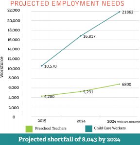
Recently, Transform Consulting Group used Tableau to complete a statewide needs assessment on Indiana’s youngest children ages 0-5 by pulling together data from multiple agencies and partners. The analysis resulted in the Indiana’s Early Learning Advisory Committee’s (ELAC) 2019 Annual Report. The intended audience for the report are policymakers who do not have a lot of time to read technical reports. Tableau equipped our team with the tools to create a visually-appealing report that draws attention to the key findings.
These are our top four tips of getting started with Tableau:
- Use Tableau support. There are many support options through Tableau. One option is the Tableau Community, which allows users to connect and ask or answer questions for each other. This can be a quick way to find answers to a common problem or question that users have. For example, we were hav
 ing difficulty with one of our state maps, and Tableau Community had a solution that we were able to implement.
 - Another option is to contact a Tableau consultant through Tableau. A consultant can provide customized personal training and guidance, which might be especially helpful for a new staff person using Tableau and/or a special project (like a dashboard). The consultant won’t do the work for you but is available along the way for further questions and guidance as you complete your project.
- Organize your data. Tableau can be picky about how the original data is organized and certain charts require different data formatting. Before getting started, it is helpful to organize your data into one spreadsheet. Transform Consulting Group prefers to use Google Sheets because it allows multiple people to work in a document and view changes real time, but Excel or Numbers can also work.
- Work with a Tableau expert. Your project might be beyond the capacity (time and knowledge) of your current team, so partnering with a group or individual who has used Tableau might be a more efficient and effective solution.
If your organization needs help with analyzing and visualizing your data, contact TCG Transform Consulting Group for a free consultation!
Disclaimer: This is not a sponsored post. We were not asked by Tableau to write this post. This is our own opinion.

