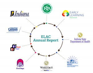
Indiana’s Early Learning Advisory Committee (ELAC) recently released its new 2018 Annual Report that was discussed in this blog post.
This year, a new feature was developed along with the Annual Report – an Interactive Annual Report dashboard using Tableau. This dashboard allows the audience to take a deeper dive into the early childhood education data included in the Annual Report.
While the visualization of a data dashboard can be exciting, it can also be overwhelming. The interactive dashboards were inspired by the Indiana Commission of Higher Education’s use of dashboards. ELAC saw the opportunity to share the data that has been collected in a user-friendly format for community stakeholders. When you are browsing the new interactive dashboard, make sure to check out these eight key features!
8 Key Features of the ELAC Interactive Dashboard:
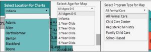
- There are five main sections of the dashboard: (1) Young Children and Families (2) Accessibility (3) High-Quality (4) Affordability and (5) Kindergarten Readiness. Simply, select the rectangle tab for the section you want to see.
- Data is compiled from multiple sources: The data that ELAC reports comes from multiple sources. A dashboard is a good format to pull together multiple data points and present it in a user-friendly format.
- Each chart is included to answer a key research question: Check out the gray boxes to identify the questions that the data is answering. This can guide the information that you are seeking to find.
- Different charts are utilized to visualize the data: Each tab includes a variety of charts to answer the key research questions. For example, maps are included in each section to display how the data varies across the state.
- Data can be filtered by different categories: Charts have the option of being filtered by location, age or program type. There are filtering options throughout the dashboard, at the top of pages or along individual charts.
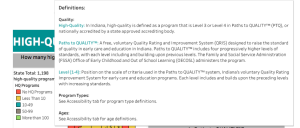
- Definitions and data sources are included: The Accessibility, High-Quality and Affordability tabs feature a “Hover for Help” option at the top of the page that features definitions related to content on the page. Throughout any page of the dashboard, hover over charts for more data and definitions.
- Data includes a ranking of counties: Each tab features a county ranking chart to help counties easily identify how they compare to the rest of Indiana’s 92 counties.
- Data can be shared or downloaded: The Tableau Toolbar is located on the bottom right of the dashboard. You can click on it Undo/ Redo/ Reset filters applied. You can share the dashboard with the url link and also via social channels, and you can also download it as a PDF.
If you have questions or comments about the ELAC Interactive Annual Report dashboard, email elacindiana@gmail.com or contact Transform Consulting Group.
Like what you see? Transform Consulting Group can help your organization develop a data dashboard customized to your needs. Contact us today for a consultation!