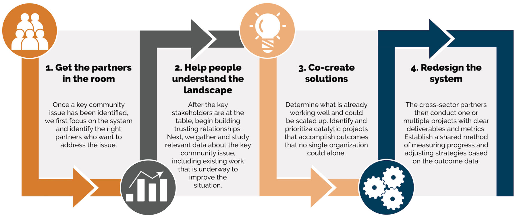
In today’s information age, organizations are overwhelmed with the amount of information that they collect, track and monitor. Non-profit leaders must decipher all the data to determine what is meaningful and relevant to share with staff, funders, Boards of Directors and other community partners. A dashboard is a great tool to bring all the critical elements together in a user-friendly report.
Through our program evaluation and research and analysis services, we help organizations create dashboards. Here are four steps to create an effective dashboard:
- Determine the audience for the dashboard. A dashboard is customized for the audience meant to view and use the dashboard, so first an organization needs to determine the intended audience. Then an organization needs to determine the key takeaways that you want the targeted audience to get from this dashboard. 0Lastly, the organization should really focus on the information that is most important and relevant for this audience.
- Decide on what the dashboard is tracking now that the audience is determined. A dashboard is meant to communicate progress over time, such as monthly, quarterly or annually. In addition, data in the dashboard can be used to compare different data sets, such as geographic locations, sites or populations. These factors need to be determined to provide the appropriate context for decision makers.
- Determine the visuals that will be most effective in communicating the message. In most cases, we work to fit a dashboard on one page. This does not provide much “real estate”, so you must be intentional about the visuals used to grab the audience’s attention and display the key messages [Sidebar: this is why we use Tableau!]. A dashboard does not have much room for wording and explanation.
- Determine the delivery of the dashboard. In most cases, dashboards are “static” or print reports that are shared via handouts or electronically. However, with the growing development of software programs, more interactive dashboards are being created. In some cases, there may be value in creating both a static dashboard that is completed annually and an interactive dashboard that is updated real-time.
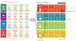 As we shared in this blog post about creating a needs assessment and annual report, we mentioned the state dashboard and county profile that we created for ELAC. After conducting the first state needs assessment on young children, ELAC realized that the amount of data and information was overwhelming. ELAC was inspired by the Annie E. Casey Foundation’s 16 indicator dashboard in their annual data book and used this to create ELAC’s dashboard.
Following the four steps above and inspired by the Annie E. Casey Foundation’s dashboard, we worked with ELAC to create a state dashboard that:
- Identifies four focus areas related to children and families, high-quality care programs, education workforce, and kindergarten readiness with 16 key indicators.
- Compares progress over time (dependent upon the release of new/ old data)
- Uses arrows (a visual tool) to depict if the numbers represent improvement (arrow goes up) or worsening (arrow goes down).
After a few years of creating the ELAC state dashboard, communities across the state of Indiana were asking for this same data at the local level. We worked with ELAC and our state data partners to gather the county-level information to create a two-page county dashboard and profile. The first page of the county profile mirrors the state dashboard with a few exceptions.
Instead of comparing progress over time, the county dashboards compare the county data to the state data. Following steps #1 and #2 above, we focused on the audience for the county dashboards who said that having their data in the context of the state data would be helpful to know if they are doing better or worse. Therefore, that ranked as a higher priority than comparing their data over time.
The second page of the ELAC county dashboard was new and provided the opportunity to add visuals (charts and graphs) to dep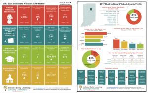 ict the key findings in the full narrative report. The visuals help to communicate complex information in simple charts.
Using a data visualization software program like Tableau is critical to not only help make the dashboards visually appealing but also to automate the process. In this case, we created 93 unique dashboards for the state and all 92 counties. While the ELAC dashboards are currently only static reports, there is the option and feature (with Tableau) of making them interactive like the Indiana Commission of Higher Education’s College Readiness Dashboard. One of our good friends, the M.A. Rooney Foundation, has also been working to transpose K-12 data for schools and community partners into meaningful dashboards.
Are you ready to get started in creating a dashboard for your organization? We would love to work with you to help you focus in on the key indicators important for your organization and create a dashboard that informs decision-making! Contact us today for help.