This is the second in a three part series of articles from Transform Consulting Group on how nonprofits can use infographics to communicate their brand, make their case, influence donors and highlight their organizations’ positive outcomes. In the first article, we discussed the basics of infographics. This article discusses how a nonprofit organization can use infographics to
maximize impact. Here are five ways that nonprofits can utilize infographics:
1. Demonstrate the need to be met and how your organization meets that need: This infographic from Court Appointed Special Advocates (CASA) of Santa Barbara County clearly shows the need and the impact that their work is having on addressing this need. This infographic communicates, “There is a credible need, and we are a part of the solution.” Interestingly, they used this infographic for their annual report (a new trend now) and as part of a fundraising campaign.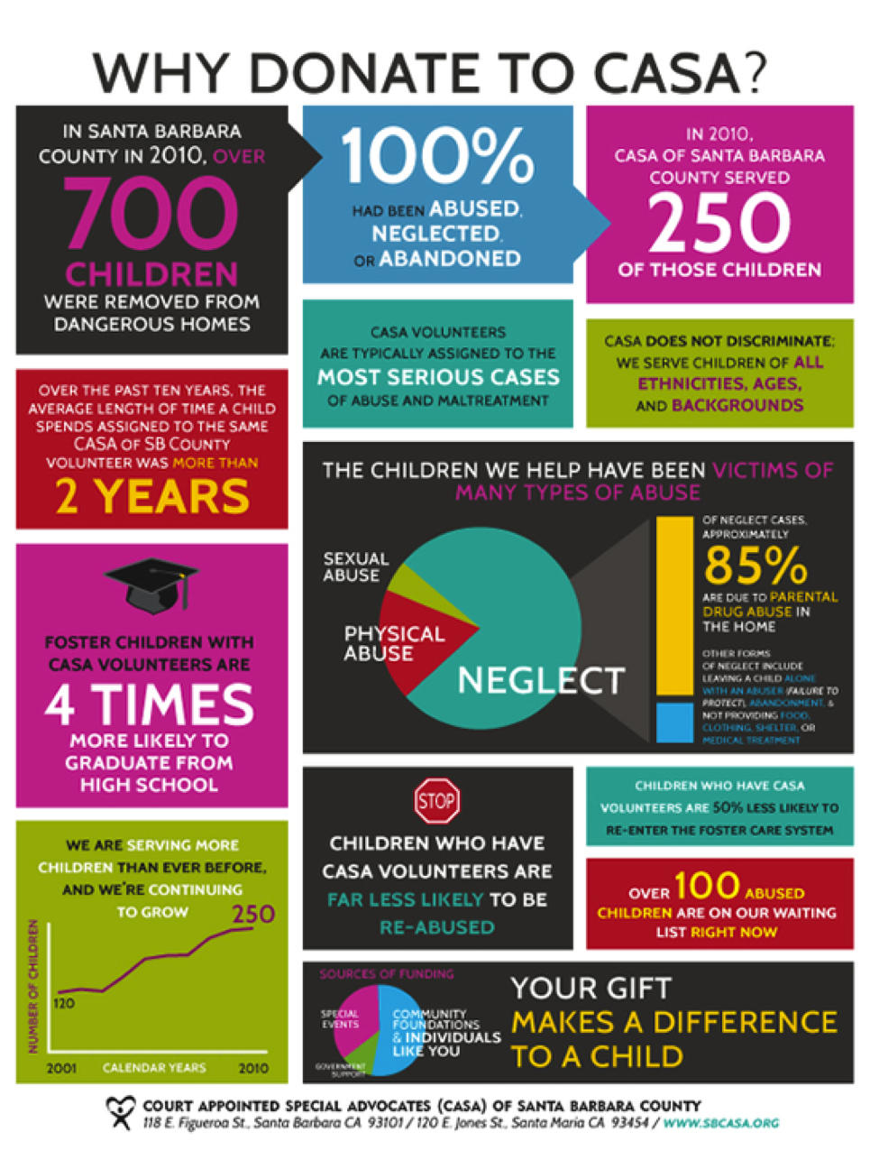
2. Visualize data: Infographics can be used to present information from a report that might otherwise be dry or boring in a traditional statistical format or narrative. This infographic from St. Jude Children’s Research Hospital displays critical information in an easy-to-follow visual display with charts, graphs and images. By changing the format and structure of the data, the reader is not overwhelmed with statistics but instead can clearly follow the data presented.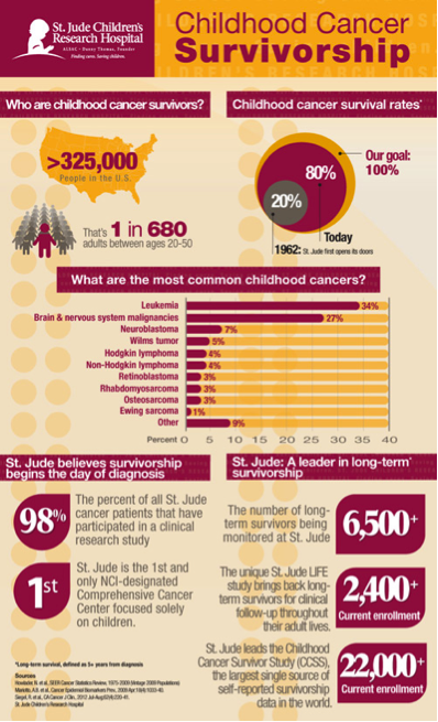
3. Move people to action: Voices for America’s Children created this simple infographic as part of their advocacy work. They used it to persuade Congress to support early childhood program funding. The images in the infographic communicate, “It is more cost effective to nurture a child than rehabilitate a young adult.”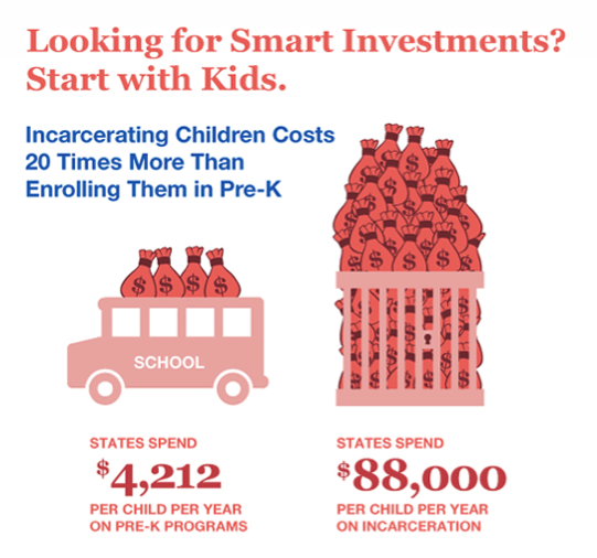
4. Inform your audience: This is a great infographic about the nonprofit sector. The Candid is “the leading source of information about philanthropy worldwide”, so this infographic supports their mission of sharing information about this industry. Did you know that nonprofits are the third largest workforce only behind retail and manufacturing?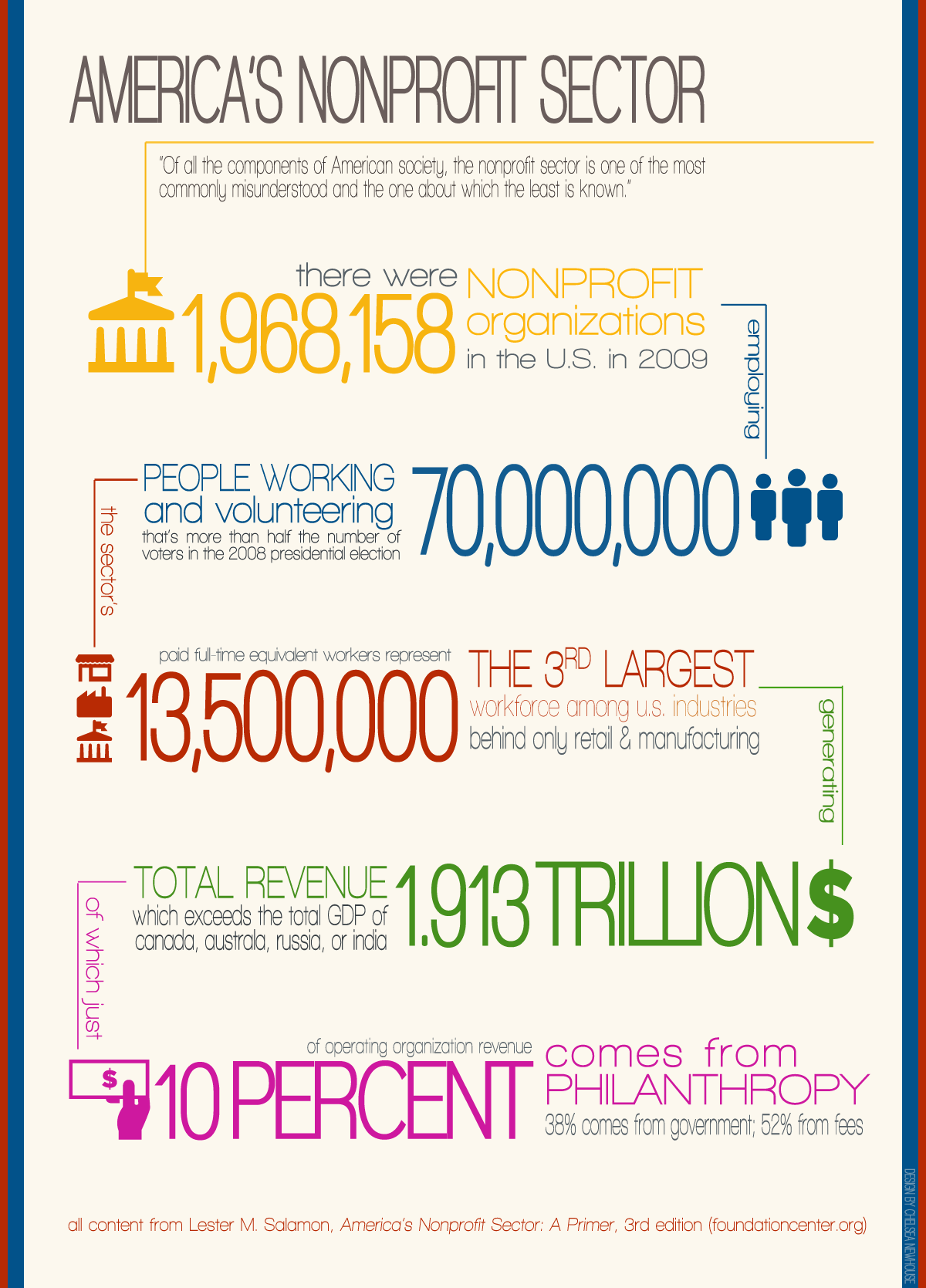
5. Show the impact of service outcomes: Many nonprofits use infographics to show “outputs” like counting activities and the number of people who are served by programs. However, funders and donors are more interested in “outcomes”, meaning showing the change that the organizations make. Far fewer infographics show what practical impact a nonprofit has on the community, but these are by far the most meaningful. This infographic from the Global Fund to Fight Aids, clearly and effectively shows how they have saved millions of lives over the last decade.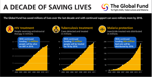
In our third blog of this series, Transform Consulting Group will discuss the tools available to nonprofits for infographic design. Interested in how Transform Consulting Group can help your organization? Contact Transform Consulting Group today!