#1: What is an infographic and why would a nonprofit use one?
This is the first story in a three part series of articles from Transform Consulting Group on how nonprofits can use infographics to communicate their brand, make their case, influence donors and highlight their organizations’ positive outcomes. What is an infographic? The term is an amalgamation of the phrase “information graphics,” which are graphic visual representations of information intended to present complex ideas quickly and clearly.
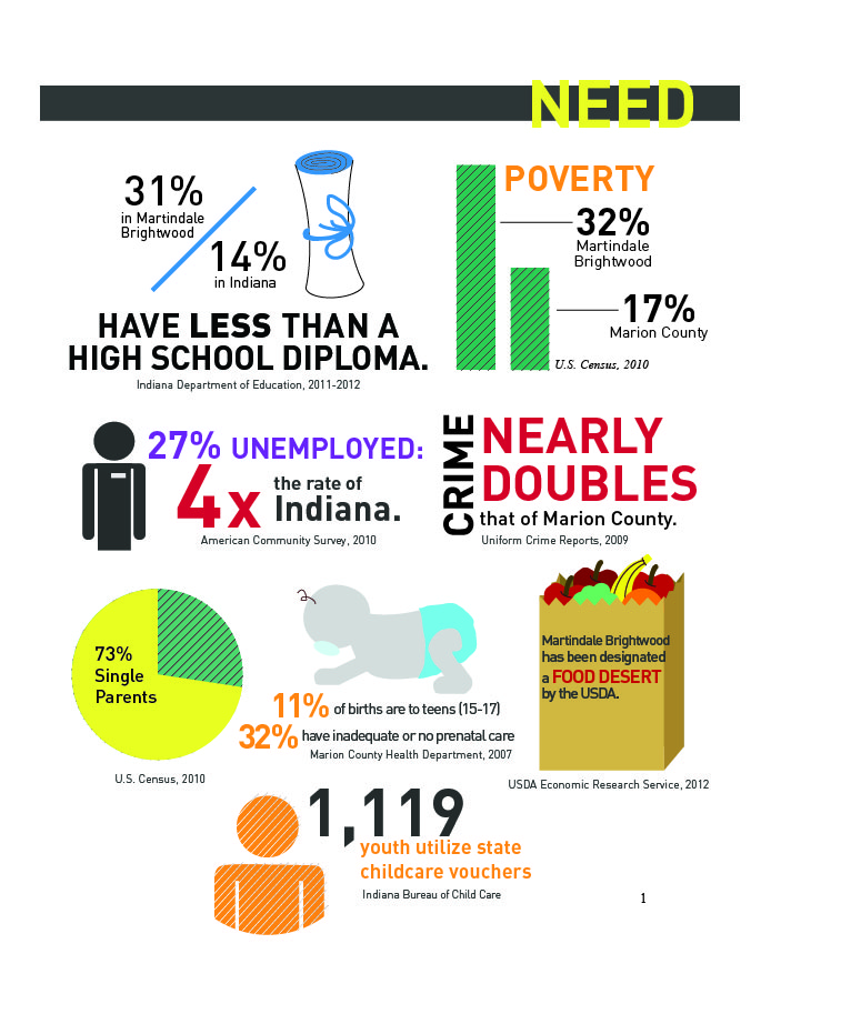
Below is an example of an infographic that Transform Consulting Group used to present data in a grant proposal supporting the need for funding to improve educational outcomes for children in an Indianapolis neighborhood:

Why use infographics? Here’s an infographic from NeoMam Studios explaining the 13 reasons why your brain craves infographics (yes, it’s an infographic about infographics). In today’s world of information overload, infographics cut through all of the “words” that we are bombarded with and instead are easier to understand and more engaging.
What makes a good infographic? Communication Nation created a “manifesto” of what makes a good infographic:
- It’s a visual explanation that helps you more easily understand, find or do something.
- It’s visual, and when necessary, integrates words and pictures in a fluid, dynamic way.
- It stands alone and is completely self-explanatory.
- It reveals information that was formerly hidden or submerged.
- It makes possible faster, more consistent understanding.
- It’s universally understandable.
- The reader does not have to search for the key data points or key story elements.
In our second blog of this series, Transform Consulting Group will discuss the many ways nonprofits can use infographics to maximize their impact. Interested in how Transform Consulting Group can help your organization visualize your message with an infographic? Contact Transform Consulting Group today!
