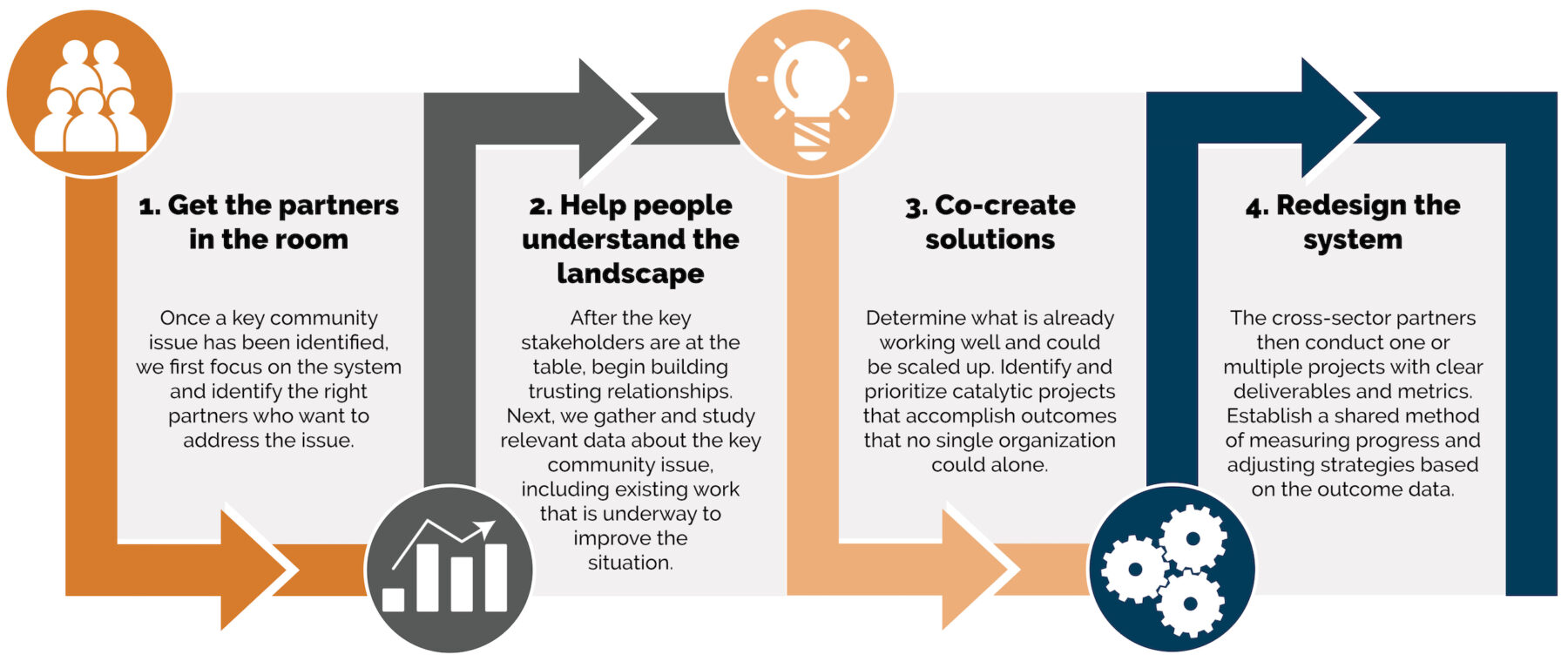
This is the first in a three-part blog series on nonprofit storytelling. According to the Social Science Research Network, the majority of people are visual learners. Recently, Transform Consulting Group published a series of articles on how nonprofits can use infographics to communicate their brand, make their case, influence donors, and highlight their organizations’ positive outcomes.
Data can be an essential part of telling a compelling story for organizations. However, raw data can be challenging to analyze and digest, even if you know how the data was gathered and organized. Data visualization can be the key to showing an organization’s impact.
Following the trend of data visualization, Google recently released Google Databoard. This interactive tool helps people quickly find data from Google’s vast archives of industry-leading research. It will even help tell a story from the statistics, turning selected charts and data points into infographics that can be shared.
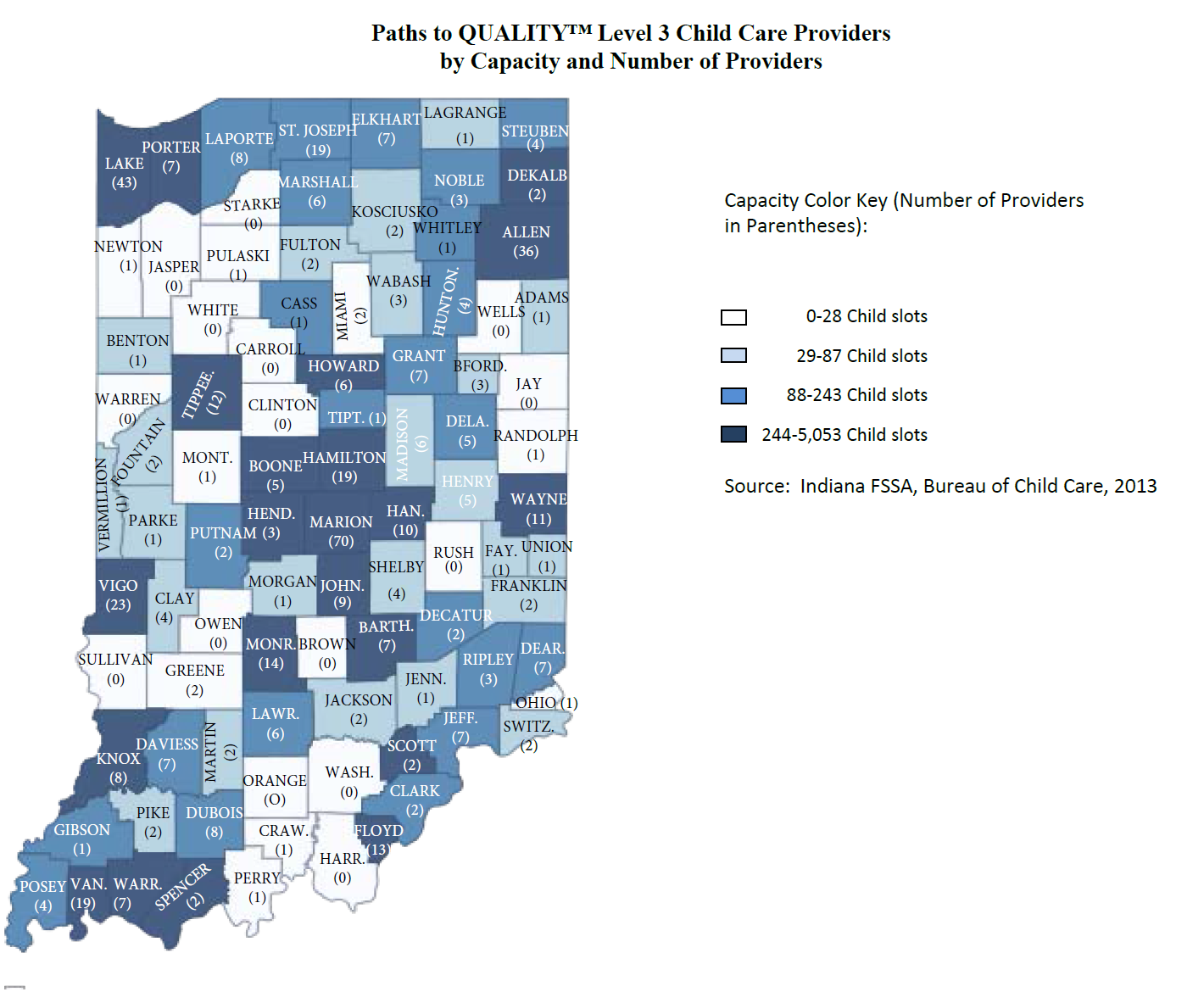
Visualizing data can also be a part of a summative report that analyzes the information collected and identifies recommendations to apply the data. As part of Transform Consulting Group’s work for the Bureau of Child Care, we prepared several state maps displaying the types and availability of Paths to QUALITYTM early childhood providers in Indiana. These maps helped Indiana’s Early Learning Advisory Committee and other early childhood stakeholders to determine the scope of the first year of the new Early Education Matching Grant program. Here’s one of the maps that Transform Consulting Group created:
At Transform Consulting Group, we love data and helping organizations use data to make meaningful and informed decisions. We can collect, track, and monitor an organization’s impact by developing an evaluation plan. But data is only as good as its use. Need help visualizing data or making your case? Contact Transform Consulting Group today for a free consultation!